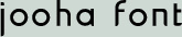


While working as a graphic designer in Korean for the last few years, I realized that there were very few font options for graphic designers to work with. There are a lot of experimental and hand writing typeface, but it is hard to find a decent typeface applicable to designs. Most designers I met in Korea complained about this reality, but no one was willing to create a new typeface for reasons that ranged from technical difficulty to create a digitized Korean font. The Korean writing system is well-known for its practicality and simplicity. However, its modular font system gets very complicated when it comes to digitizing a font. Unlike western font designers who only need to design 26 characters, Korean designers need to consider designing thousands of various modular combinations of different characters. Moreover, since most Korean font designers are using western font creating software, which focuses on linear writing systems, it becomes even harder for the designers to create a modular typeface. As a result, it takes more than one designer to create a typeface within a year. I felt a great responsibility to designers facing this issue and designed a Korean typeface named Jooha for my graduate thesis. The project was not only to create a new Korean typeface, but to follow and promote an innovative way called Se-Beol-Che, which minimizes the process of creating a Korean typeface. As I mentioned above, the complexity of making a digitized Korean typeface has discouraged the development of Korean fonts. However, this innovative method dramatically reduces design time and eventually helped me to complete a set (bold and light) of Jooha font in six months. Se-Beol-Che was inspired by a Korean typewriter, and was introduced by Dr. Byung-Woo Gong in 1950. However, the first digitized font which adopted this method did not appear until 1985 when a designer named Ahn-Sang-Soo introduced a typeface called Ahn-Sang-Soo-Che. Since then, it has inspired a number of designers to create new typefaces for the Korean language. In the traditional method, a square format dictates the design of every character. The new method allows elements to group in more open and varied configurations. This reduces the number of characters that need to be designed from about a thousand to less than sixty-seven by maintaining each character’s proportion throughout different syllables. As a result, the typeface breaks the rigidity of traditional Korean typefaces by creating open spaces between different heights of syllables. At the same time, it also creates visual rhythm when the characters are laid out in a sentence, since each syllable appears up and down from the baseline just like lower case in latin typefaces. In order to build the visual concept for Jooha font, I researched various types of Korean typefaces and categorized them into modern, traditional, experimental, and conservative. After looking at different typefaces, I realized that although I wanted a modern and geometric typeface, I do not want to ignore the organic beauty of traditional typeface. I wanted to bring out some of the brush strokes from traditional typeface and inject them into an overall modern appearance in a controlled manner so that the individual characters of Jooha font honors both the organic and geometric qualities of Korean letterforms, while its overall appearance strives to be modern and neutral in order to function within a wide range of applications like Univers and Helvetica in English type. In order to present and give Jooha font to the public, I created a website that functions as a bridge to users. The website introduces the project and the innovative method, Se-Beol-Che, and allows people to download the typeface. The typeface is promoted through design blogs and an Internet typography magazine run by a prominent Korean font haus, encouraging people to visit the web site and download the font. Since March 2009, over 250 people have downloaded the font and many more are continuously visiting the site every day. My thesis is to provide a typeface designed especially for Korean graphic designers and encourage adopting an innovative way to design typeface in order to overcome the limitation, which Korean designers face. This innovative method called Se-Beol-Che minimizes time and energy spent to create a typeface and brings out the beauty of modular typeface by having different heights of syllables. Despite of readability issues with different heights of syllables, studies and tests proved that though people’s eyes much adjust to new style, it reads more correctly than traditional typeface. Since 1985, it has slowly been adopted by many designers and it is beginning to be accepted by the public recently. Many Se-Beol-Che typefaces have increasingly appeared on the web, and Korean font foundries recently made a separate category for these types of fonts on their website to sell. Korean typography is in a transitional period and one of the main goals of the thesis is to become a part of this movement. Koreans have already gone through the change from vertical writing/reading to horizontal writing/reading in the 1980s and 90s as they adopted western culture and its writing system. Now more people in Korea should recognize that the structure of Korean needs to be changed for the development of Korean typefaces. As Jooha Font is provided to the public, it will simultaneously promote Se-Beol-Che. A variety of typeface will aid the development of Korean typography and Jooha font will be a help to make the change.